
In my ‘How to create a unique logo’ I’ve already talked about the psychology of colors shortly, and how they are important for your branding. I’ve mentioned that cool or warm shades and even different hues of certain colors evoke certain emotions. But colors can also interact and create an even more powerful impact through their copresence. That is the underlying premise of color schemes.
If we think about nature’s beauty, we can recall many different color schemes and their emotional impact. A calming sunset over the sea with all its tender pastel colors and an image of an erupting volcano with its intense contrast and different black, red, and orange hues are maybe equally beautiful. But they make a very different impression.
Taking it a step further, you can also think about what kind of landscapes your clients would be liked to be placed in. Would they like to be energized or rather calmed? Would they like more structure or more variety? Would they like to feel comfortable or rather intrigued or surprised?
The practical guide to creating color schemes
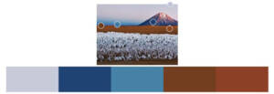
There are color schemes for any of these needs. And if you can think of a matching landscape and find an image of it, you can take the color directly from there. One excellent tool for this is Adobe Color. Here’s a color scheme it has generated for me based on a landscape image. The calculation of these schemes is supported by algorithms that ensure that the result is somehow harmonious. There are also different options to choose from, like complementary or hue-based schemes.
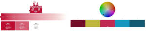
If you already have a brand color, like the base color of your logo, you can use that as a base. You can even calculate color gradients with the same tools. Here is an example based on The Cecily Groups logo and the complementing color scheme based on the main color.
The results can be further adjusted until the desired outcome is reached. If you have neither an imaginative landscape nor a base color in mind, you can also look up the current color trends and create harmonies based on that. The Pantone Color Institute has one tone selected as Color of the Year since 2000. They also make color trend forecasts like the one base on the New York Fashion Week Spring/Summer 2022.
You can also use a reversed method and search images with certain colors or color combinations. This can give your ideas of new, unusual color harmonies. Some tools for that are Multicolor and Designspiration. In a limited way, even Google Search can do that: you can select certain colors under search tools.
As we see, graphic designers are sometimes get inspired by nature, fashion designers, or even Google searches. But when forecasting fresh, upcoming visual trends probably the most useful approach is looking at the fine art scene. The reason is that lot of the revolutionary ideas are boiling down from their thought and applied arts to popular trends. But it sometimes takes years, partly because fine arts trends can feel way too abstract in their original form. However, when it comes to colors, I think it’s pretty safe to use them directly.
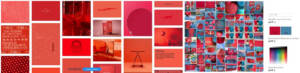
As an example, I took Fares Micue’s Spring Breeze from Saatchi.
Websites with striking colors
Here I took some of the most praised website designs of the last years to look at their color scheme. I think we can see that they have a solid base in terms of colors so that the palette they are using could stand on its own.
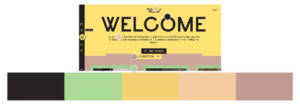
My first example, ‘I Spy’ has a playful and bright scheme that it fits the content very well since it’s a site for exploration and play.
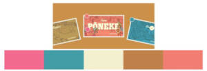
The Franshalsmuseum.nl also has some candy colors but they have one yellow shade dominating over the other colors, which makes the layout very powerful.
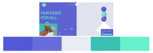
In the case of swabtheworld.com, two colors rule over the layout, and the combination feels equally harmonious, unusual, and modern.
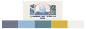
The 2019.makemepulse.com also has a similar blue, green, and grey scheme, but it’s still very different. To match the art nouveau style illustration, it has toned down color on a textured base, that gives a vintage feel.
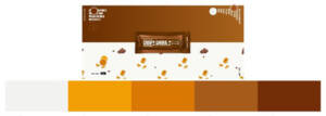
The simply chocolate site is an interesting example because here the other hues had to harmonize with the product’s color, chocolate. I think it worked out very well and it also serves as a good example of how a gradient background can be tasteful.
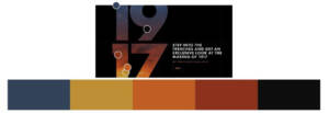
I also wanted to list some good examples of dark themes, and I believe the intothetrenches.1917.movie site is one of them. Since it’s dedicated to a war movie, going darker seems like a reasonable choice. It looks very intense but sophisticated, thanks to the simple layout.
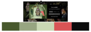
Another design to mention on the darker scale is moooi.com. What I’ve found interesting here, Is that despite the dark background and red highlight, which is similar to the previous example, this color scheme makes a very different impression. Its toned-down, pastel colors, and calming greens give a rather meditative, spa-like feeling.
I hope with these different examples I was able to give you an idea of the current color trends in website design, and how different combinations can reach very different outcomes in terms of expression.
Summary
While a nice color scheme might seem like just a nice addition, we’ve seen how it sets the tone for your website and branding. At the Cecily Group, we are dedicated to forming a consistent brand strategy from the smallest details up to the big picture, because we believe it helps to create and maintains customer trust. We wish you the best of success in finding your path!