The ancient symbols behind logo archetypes
The history of logos goes back to religious symbols, hieroglyphs, and shop signals. They are all based on the idea of communicating identity visually. In many cultures, numbers and geometrical shapes are linked to symbolism. For example, the number one and circles are associated with wholeness and unity, while the number four and the rectangle shape are associated with stability, and triangles often represent movement; based on their orientation, they can indicate a direction. Apart from geometrical shapes, there are also organic and abstract shapes. By nature, they represent something more chaotic and human – but even those can be reduced to basic geometrical shapes. In creating a logo, the underlying shapes will anchor the image in the viewer’s imagination and memory, so the choice of shapes is key.
The psychology of fonts and colors
Another important step in creating a logo is to consider colors and accompanying fonts. In considering the color, think about the following question: What emotional response should your audience have when they see your logo? There are cold and warm colors; based on their saturation, they can feel calmer, but less vibrant – or more vivid, and less balanced. Even among the warm colors, there are differences, for example, red shades generally feel stimulating, vibrant, and passionate, while yellows are more friendly and cheerful. Among the cooler shades, different kinds of blues can give very different impressions – like a royal blue, which feels conservative and dignified, compared to a calming turquoise, which evokes peace and tranquility. Fonts faces can be also quite emotionally charged and can be very specifically tied to a company – think of the famous “Disney” font. Everyone knows it’s Disney when they see those funny looped W’s, or the big D with a swoosh at the top. Once you choose a font, your audience will associate it with your company – so choose carefully. Keep in mind that clarity is more important for fonts than emotion; if it’s too hard to read, there must be abetter option.
A logo that speaks to your target audience
Now we need to think about some important communication questions. What message would feel right for your business? How do you want to convey that message in your logo, and to whom are you speaking? The more specific the target audience, the more tailored and specific the logo can be. On the other hand, to reach a very wide audience, a logo should only be 1) instantly recognizable in its shape and 2) memorable in terms of color. To get an idea of the range of possibilities, let’s look at examples of existing logos.
Generic logo examples
Most business sectors have their branding cliches when it comes to color, font, and logo choices. Maybe it seems like a logical choice– but it won’t help you to stand out from the crowd. See this blog by Lisa Catarineau

Image credit: Graphicdesignbylisa
Looking at these logos, you can see that the companies chose their logos so that their sector can easily be identified. However, this strategy can backfire because the logo becomes one of many. It can be a real challenge, in the “log overs”, to come up with something truly exceptional.
What makes a logo uniquely memorable?
If you want to create a logo that is “all yours” and not just related to your sector, there are different ways to catch your audience’s attention and get your logo to stick in the viewer’s mind. To get an idea of what makes a logo memorable, let’s take a look at some familiar examples.
Logos work by showing a picture of the company’s name or product
Some logos work because they are so literal, people can recall them anytime, just by thinking of the company’s name.
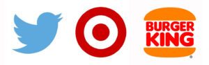
Twitter’s logo is a tweeting little bird. It was originally a cheap stock image but has since gone through some branding updates.
Target’s logo is a target.
Burger King originally had an icon resembling the sun, however, later on, they used an illustration of the Burger King. The logo consisting of two halves of buns with the company’s name in between was the one that became iconic.
Another example: Nike’s swoosh sign together with the slogan “just do it” conveys the movement and energy associated with sportswear well.
Surprising logo examples
Some logos work by using the element of surprise; they stick in your head because they seem like an odd choice.
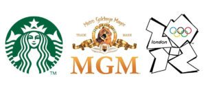
Starbucks’ mermaid logo might seem out of place and strangely detailed, but it’s very recognizable and has since become iconic.
MGM’s logo– with its lion– was an ambitious undertaking back in the day when they had to film the animated version using a real lion. And there is no obvious reason they wanted to do this. But it’s surely an image that is hard to forget.
The 2012 London Olympics logo was a subject of awe and outrage in the design community and it still looks very modern – some consider it a failure, but even those who don’t like it still remember it. We still don’t know what it’s exactly about and it looks chaotic – but it has a lot of movement and energy.
Well-thought-out/ clever logo examples
Some logos are memorable because they are clever. They often successfully incorporate some key elements of the company identity in the logo, letters, or even words of the company name. But it also happens that they have some hidden elements that make people think about the design. See this blog about hidden meanings in logos from Bored Pandas for more info. (Examples below, credit: Bored Pandas)
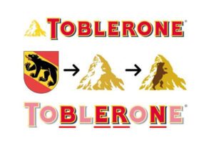
Toblerone: Shows the city of Bern (where Toblerone is made). The logo also has a bear silhouette because the place is also known as the city of bears.
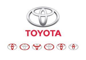
Toyota: Every letter from the name of the company is present in one unified symbol.
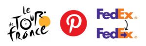
Tour de France: The current logo was created by Joel Guenoun. The yellow sun also represents the jersey of the same color awarded to the winner of each stage. It features a typographic sketch of a cyclist within the word ‘Tour’, as a brush script.
Pinterest: the logo was introduced in 2011 with the letter “P” stylized as a pin, as a reference to the main feature of the website.
FedEx: The arrow in between the two words in the text shows that the company is always on the go, striving to get things done.
Iconic logo examples
Some companies became so significant, it’s hard to tell if they have a good logo choice anymore, or if we just have seen it so many times that it became familiar to us. Some of these logos might be good – but probably, they didn’t have to be outstanding to become iconic. In that sense, the success of these designs is tied to the company’s far-reaching success and permeation of the market. Examples of logos like this include Microsoft’s logo, Amazon, eBay, and Google.
Logo evolution examples
Companies change over time, and that change can also be reflected in the logo. Altering the logo is often a good way to communicate a change in business strategy to the customers.
The Apple logo is a prime example of a minimalistic logo that is scalable; it works well, even as a small icon. But it hasn’t always been that way. They went a long way from having an illustration of Newton as a logo. Over time, their logo has gone from looking home-grown to representing Apple’s signature sleek design: see this related blog from thelogocreative about the evolution of Apple’s design.
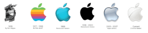
Image credit: Thelogocreative
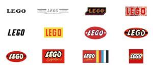
It also took a while for Lego to find the way to their playful signature look—see this blog by Logaster for more information.
The question is – can we cut this quest for our true identity short when searching for an ideal logo, or does it have to be a reflection of our company’s journey? Rebranding can be very expensive, so this is an important consideration when starting your logo journey.
Branding cost: the most expensive logo examples
It’s no accident that all of these falls into the rebrand category – only established companies have the resources to invest in a new visual identity.
BBC: Total Cost: $1,800,000 the 1971-1988 BBC logo was the logo with the longest life on screen, so considering both this and the scale of the rebranding for such a global network, it was probably money well spent.
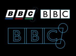
Image credit: Behance
Pepsi: Total Cost: $1,000,000. This was done to catch up with the Coca-Cola brand.
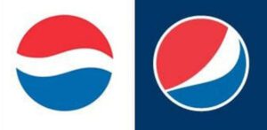
Image credit: Nader.io
BP: Total Cost: $211,000,000. The only element that was retained from the previous logo was the green and yellow color scheme, and it was meant to represent BP’s strategy of green growth. According to this blog article from the creative co, this has been deemed another necessary rebranding—especially after the 2010 oil spill disaster.
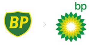
Image credit: Thecre8tiveco
Branding cost: the cheapest branding examples
Not every successful logo stems from a whopping budget. We already mentioned that Twitter’s logo was originally a 10-dollar icon, but there are other examples as well. The original Google logo was designed in 1998 by Sergei Brin, one of the co-founders of Google, in Gimp, a free graphic software. It cost nothing– just like the Coca-Cola logo. That was designed by M. Robinson, the partner, and accountant of John S. Pemberton, the company’s founder. The company name was also his suggestion.
The thinking process behind our logo
At The Cecily Group, our two main objectives with the design were to “be classy” and “stand out”. During the initial phase, we had many ideas, but nothing felt right. Based on the company’s name, we tried to work with the initials and a girl’s silhouette, but the results were not original enough.
The final idea came in a dream to Nick (the company’s founder). He made a draft of it and explained it. Everyone agreed that it was the real thing. However, we still had to find the right visual style for it.
The whole process was very difficult in one sense and easy in another sense. It was difficult in terms of having this very vague idea put into a first draft but being at 80% of what we wanted to have—it was that 20% of getting to what we wanted to have that was so tough. It got to the point where you changed one thing and then you felt you had to change everything else.
I produced multiple versions, presented them to the team, and let the team decide on the final version. We believe the logo should create an emotional connection to the company, not only externally but also internally. For that reason, it felt right to have the whole team involved.
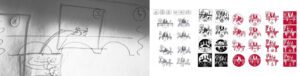
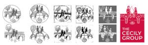
The original drawing by founder Nicholas Schwarz and some of the early sketches by me for the Cecily Group logo
Our logo design evolution
Our logo is an illustration-style logo, which is not as popular at the moment, so it is unique for the times. All illustrational logos are storytelling logos, and because we had this complex message, we needed this format.
After some design rounds, we decided to test the logo within the design community and people seemed to react very strongly to it. It got an unusually high number of feedback comments, both positive and negative. We incorporated some of the community’s feedback into revisions but stayed with the initial idea—because we felt that a truly original design will always divide the audience. This also goes for the choice of color in our logo, which Nick has dubbed “unicorn blood red”: It resonates with our company’s courage and inventiveness, and as such, represents a better choice for us than being safe, but boring. Our font, on the other hand, is more conservative, echoing our clients’ desire for stability and endurance.
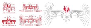
Some of the design versions, and the final, full-size logo
Examples of use for our logo
Below, you can see the final result: a clearly expressed vision, attractively printed and yet not so quiet as to fail to attract attention. It is really important to get the logo right from the beginning because the whole visual identity will be derived from the logo design. Our logo is unique because it’s designed on the principles of the company itself, and the story of the company that we want to tell our clients.
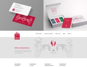
Usage of the final logo design in different formats
When designing your logo, keep these five factors in mind:
- Logo message/ symbolic meaning
- Logo shape
- Logo color
- Logo font
- Generic, or unique?
If you break your logo-creating process into these logical steps, you can create a logo that is both satisfying to look at and truly communicates the message at the heart of your company. We wish you a happy design!