Introduction
Interactive charts provide users with the ability to explore data according to their own preferences, allowing them to focus on specific time periods, compare multiple datasets, and uncover valuable insights that might be missed with static visuals. When it comes to financial data, this level of interactivity is particularly advantageous for investors, analysts, and decision-makers who need to make informed choices. Interactive charts can also facilitate real-time data feeds, enabling users to track stock prices, currency exchange rates, or other financial metrics as they evolve.
The animated elements present in interactive charts serve to guide the audience through reports by highlighting key points and trends and creating smooth transitions between different views or periods. This narrative approach can make interactive financial reports even more engaging and persuasive.
In this article, I will explore various ways to make commonly used financial charts more interactive and discuss the role that animated elements can play in taking them to the next level.
Types of Interactive Charts
Here are some common types used in financial data visualization:
1. Bar and Column Charts:
Bar charts are versatile and widely used for comparing categorical data. They consist of horizontal or vertical bars, with the length or height of each bar representing a specific data value.
Interactivity: Users can interact with bar charts by hovering over bars to display tooltips, clicking to drill down into subcategories, or toggling the visibility of data series in grouped or stacked bar charts.
Use Case: Analyzing market share by company.
Column Chart demonstration by HighCharts.
2. Line Charts
Line charts are excellent for displaying trends and changes in data over time. They connect data points with lines, making it easy to identify patterns.
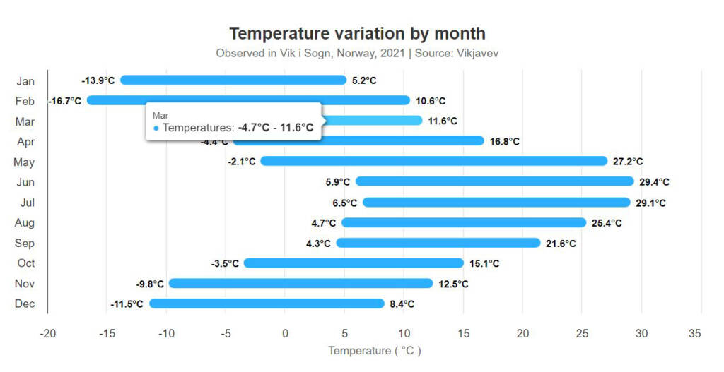
An area chart also consists of value points connected by line segments but adds shading between the line and a baseline. This chart is most often used to show both how the total and its components’ contributions have changed over time, called stacking.
Interactivity: Users can interact with line charts by zooming in on specific time frames, highlighting data points on hover, or toggling data series on or off.
Use Case: Showing stock price fluctuations.
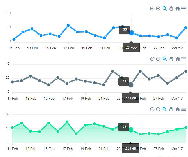
Syncing Line Chart demonstration by ApexCharts.
3. Pie Charts
Pie charts display data as slices of a circular chart, with each slice representing a proportion of the whole. They are useful for showing parts of a whole.
Interactivity: Users can click or hover over slices to highlight and display specific values or categories.
Use Case: Displaying the composition of a budget, showing the distribution of expenses, or visualizing market share by product category.
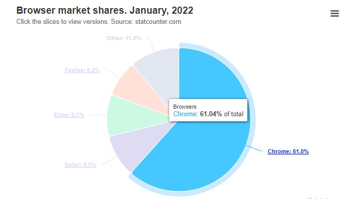
Pie Chart demonstration by HighCharts.
4. Scatter and bubble charts
Scatter plots and bubble charts plot individual data points on a Cartesian plane, making them ideal for visualizing relationships and correlations between two variables.
Interactivity: Users can interact with scatter plots by zooming in on specific data clusters, hovering over points for details, or toggling between different data sets.
Use Case: Assessing the correlations between income and expense or identifying outliers in data.
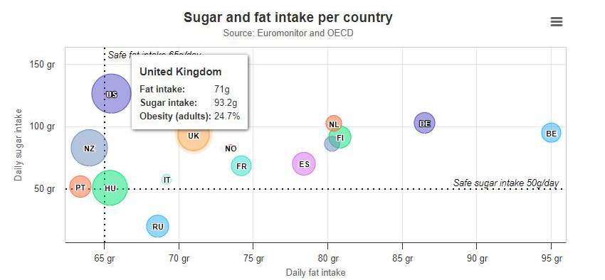
Bubble Chart demonstration by HighCharts.
5. Sankey Diagrams
Sankey diagrams are specialized flow diagrams that represent the flow of resources or quantities from one category to another. They are particularly effective for visualizing processes, such as energy flows, budget allocation, or supply chain logistics.
Interactivity: Users can interact with Sankey diagrams by hovering overflows to view quantities, exploring subflows, or filtering data to focus on specific aspects of the flow.
Use Case: Illustrating budget allocation.
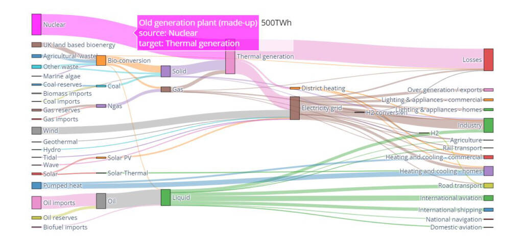
Plotly-based Sankey diagram by Tom Counsell via Mike Bostock: Energy forecast for 2050, Department of Energy and Climate Change.
6. Heatmaps
Heatmaps use color gradients to represent the intensity or distribution of data values across a two-dimensional grid. They are ideal for visualizing patterns and trends in large datasets.
Interactivity: Users can interact with heatmaps by zooming in on specific regions, hovering over cells for data details, or adjusting color scales.
Use Case: Identifying trends in stock price movements.
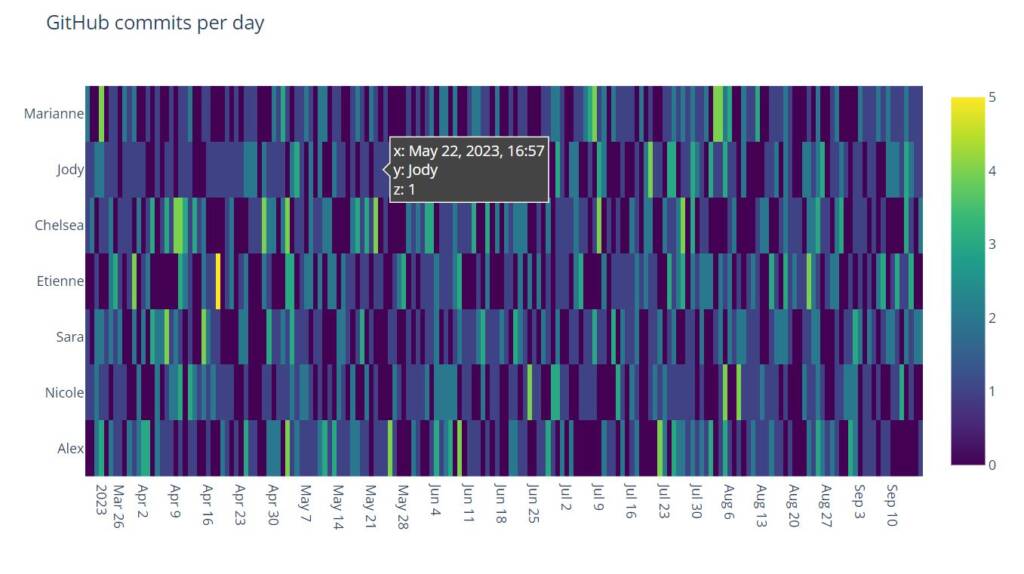
Heatmap demonstration by Plotly.
Creating Interactive and Animated Financial Charts
Here are the practical steps to create interactive and animated financial charts:
1. Choose the Right Visualization Library
Several free JavaScript libraries are available for data visualization, such as Chartist and Chart.js, and some are also open-source like D3.js. Google also has a JS / SVG charting library that can be used independently or within their BI tool called Looker.
Companies such as Highcharts and Plotly provide paid options with advanced chart selection and libraries for multiple programming languages, like JavaScript, Angular, React, VueJS, iOS, R, .NET, and Python. Python is excellent for data calculations and analysis, while JavaScript and its libraries are well-suited for creating interactive web-based reports, but any of those could present a good choice considering your developer’s competencies.
2. Gather and Prepare Data
Collect the financial data you want to visualize and ensure it’s in a format that your chosen library can work with. Both JavaScript and Python can handle JSON (JavaScript Object Notation) or CSV (Comma-Separated Values) files. JSON is a popular choice for representing data for complex diagrams like Sankey diagrams. It allows you to structure data hierarchically and you can define nodes and links in it, specifying the source, target, and flow values for each link.
3. Implement Interactivity
Use the library’s features to add interactivity to your charts. This might involve adding features such as:
Tooltips
Tooltips provide additional information when users hover over or click on data points or elements in a visualization. They are useful for displaying details, such as exact values, labels, or descriptions.
Use Cases: Tooltips are beneficial in various types of visualizations, including bar charts, line charts, scatter plots, and maps.
Zooming and Panning
Zooming in and out and panning across a visualization is valuable for exploring large datasets or detailed portions of a chart.
Use Cases: These interactions are beneficial in maps, heat maps, and large line or area charts.
Filtering
Interactive filters allow users to focus on specific subsets of data. Users can select criteria, categories, or periods to refine the data displayed in the visualization.
Use Cases: Filtering is essential in dashboards, where users want to customize what they see, and in financial reports where different metrics or time frames are relevant.
Highlighting
Highlighting involves making certain data points or elements stand out visually in response to user interactions. For example, clicking on a category in a pie chart can highlight that category and dim others.
Use Cases: This interaction is useful in pie charts, tree maps, and bar charts to emphasize specific data points.
Drill-downs
Drill-down functionality allows users to navigate from an overview of data to more detailed information.
Use Cases: This is commonly used in hierarchical visualizations like treemaps or sunburst charts, where users can click on sections to see subcategories and further details.
Interactive Legends
Legends in a chart can be interactive, enabling users to toggle the visibility of data series or categories.
Use Cases: This is particularly useful in line charts, stacked bar charts, and area charts to simplify complex visualizations.
Slider Controls
Sliders allow users to adjust parameters like time ranges or thresholds dynamically.
Use Cases: In financial reports and time series charts, sliders can help users explore data over different periods.
Annotations
Users can add custom annotations or notes to specific data points or sections of a visualization.
Use Cases: This is handy for adding context or explanations to the data, especially in line charts, scatter plots, and heat maps.
Interactive Tables
In some cases, interactive tables that allow users to sort, search, and paginate through data can complement visualizations.
Use Cases: This is useful when presenting financial data in tabular form alongside charts.
Real-Time Updates
Interactive elements can allow users to monitor live data streams and respond to market changes in real-time.
Use Cases: For financial data dashboards, real-time updates are essential.
4. Add Animation
The purpose of chart animation is to make data visualizations more appealing and provide visual feedback during data loading, or data updates through smooth transitions instead of abrupt jumps. To animate your charts, you’ll need to define transitions between data points or periods. Most visualization libraries offer built-in functions for creating smooth animations.
Data Entry or Loading Animations
Examples: Loading spinners, progress bars, or the gradual rendering of data points in a chart as data loads.
Use Cases: Any chart or visualization that relies on live or dynamic data, such as real-time financial market data dashboards.
Transitions and Smooth Updates
Examples: Animated transitions between different datasets, smooth line or bar transitions in time series charts, and crossfading between chart elements.
Use Cases: Time series charts, financial trend analysis, and comparisons of data series over time.
Bar Chart Animations
Examples: Bars growing or shrinking in response to data changes, or cascading animations for stacked bar charts.
Use Cases: Comparing values across categories, showing changes in rankings, or illustrating trends over time.
Line Chart Animations
Examples: Smooth transitions of line paths, with lines appearing or fading in response to user interactions.
Use Cases: Visualizing trends, seasonality, or cyclic patterns in time series data.
Pie Chart Animations
Examples: Exploding a slice, expanding or contracting the radius of a pie, or smoothly highlighting selected segments.
Use Cases: Representing parts of a whole, showing proportions, or highlighting key data points.
Scatter Plot Animations
Examples: Animated transitions when filtering data points, highlighting clusters, or connecting points with lines.
Use Cases: Displaying correlations, clusters, or trends in multidimensional data.
Map Animations
Examples: Animations for visualizing time-based data, such as heatmaps that show changes in data intensity over time.
Use Cases: Geospatial analysis, tracking changes in location-based data, or displaying real-time data on maps.
Area Chart Animations
Examples: Smooth transitions between data series, with areas filling in or fading out gracefully.
Use Cases: Showing cumulative data, stacked data series, or illustrating trends over time.
6. Test and Integrate
Don’t forget to test your interactive and animated charts across different devices and browsers to ensure a consistent user experience and optimal performance. Integrate the charts into your website or application with consideration to your overall design and user interface, by updating your them with your brand colors and fonts.
Conclusion
Interactive and animated charts are revolutionizing the way we present financial data. They offer enhanced understanding, real-time insights, and the ability to tell compelling data stories. By choosing the right visualization library and highlighting the right data points, you can create engaging financial reports and application dashboards that empower your audience with the information they need the most. Read more about our financial reporting services here.