
A brief history of popular typography
In Steve Jobs’ famous Stanford Commencement speech, when talking about the importance of trusting your instincts, talked about how auditing a calligraphy class at college contributed to his success with Apple: “I decided to take a calligraphy class to learn how to learn calligraphy. I learned about serif and sans-serif typefaces, about varying the space between different letter combinations, and about what makes great typography great. It was beautiful. Historical. Artistically subtle in a way that science can’t capture. And I found it fascinating. None of this had any hope of any practical application in my life. But 10 years later, when we were designing the first Macintosh computer, it all came back to me. And we designed it all into the Mac. It was the first computer with beautiful typography. If I had never dropped in on that single college course, the Mac would never have multiple typefaces or proportionally spaced fonts. And since Windows just copied the Mac, no personal computer would likely have them.”
Apple’s first Macintosh computer came out in 1984 and it was also the very first personal computer with a set of proportional fonts, instead of monospaced – they had Helvetica Neue as a system font up until 2015 when they released their typeface called San Francisco, that has been inspired by Helvetica and DIN. In the same year, they also introduced the PostScript language, an interpreter between computers and printers that enabled desktop publishing. The next year Adobe (then called Aldus) came out with PageMaker, which together with the PostScript technology opened the field of print design for the public. As a result, the demand for fonts and their usage has become widespread and increased dramatically. The design wars between the tech giants Adobe. Microsoft and Apple initially resulted in different digital font formats, Type 1 and True Type, but they later reconciled and introduced Open Type together: a single font file that can work on both Mac and Windows.
Still, early Internet sites used fonts already available on a user’s computer or web-safe fonts. Since Mac and Windows computers were using different font sets, websites looked different depending on where they were viewed. The web-safe fonts meant a small group of fonts found in both environments. In 2009 Type designers and Web designers reached a consensus on a format to distinguish Web fonts from desktop fonts, called Web Open Font Format (WOFF). The WOFF format decreases load time through compression while incorporating information about the font’s origin and licensing so that fonts on the web couldn’t easily be copied for use on the desktop. This way, they protected the licensing for font developers but let web designers integrate almost any font into web pages. In the same year, Small Batch Inc. announced the Typekit project, a subscription-based service for designers, allowing fonts to be embedded via the @font-face CSS declaration. As a result, typography conquered the internet, and from a niche field with a few hundred dedicated professionals it became a million-dollar business.
Nowadays font choice is an inseparable part of any brand identity, online and offline. As such, it has a role in conveying the right clues about your company. But often a font has more to it than just a ‘feel’ – its origin, history, and reputation can also strengthen or contradict the overall message.
Typography categories
In 1954 Maximilien Vox created the Vox-ATypI classification for typefaces that was later adopted by the Association Typographique Internationale and also became the basis of the British Standards Classification of Typefaces – and still widely accepted as a standard today. It groups typefaces according to their main characteristics, based on several formal criteria: forms of serifs, axis, height, etc. These characteristics are often typical of a particular century. It defines archetypes of typefaces, but many typefaces can exhibit the characteristics of more than one class.
The Classical
is characterized by triangular serifs, oblique axis, and low stroke contrast. It’s sometimes also called Oldstyle.
The Moderns
are characterized by a simple, functional feel of the late 19th century and early 20th century.
The Calligraphic
is characterized by a suggestion of being hand-crafted.
Each of these categories can include serif and sans serif fonts, and each of them has its sub-categories, for example, Calligraphic fonts which evoke the engraving or chiseling of characters in stone or metal are called Glyphic, while fonts that were modeled on late medieval designs written with a broad-nibbed pen are called Blackletter.
Typefaces can also be divided into four basic groups serif, sans serif, script, and decorative styles. Serif typefaces have a decorative line added to the ends of a letter or character.
Tips for finding the best fit
Serif fonts
and especially Serif Classics’, are often seen as a conservative choice, trustworthy and professional, but on the less positive side, authoritative, rigid, and scholarly. It also depends on the font choice, of course, for example, Bodoni feels a bit more approachable than Times New Roman, probably because it’s slightly elongated and not so orderly.
Sans serif fonts
and especially Sans Serif Moderns, are usually seen as a practical choice, clean and neat, but on the less positive side, can be perceived as something generic or cheap. But again, it depends. For example, Arial is one of the most commonly used fonts and many hate it because of its lack of character. Akzidenz Grotesk is also a sans serif font, but at the same time it’s classified as classic, so it has a timeless feel besides being screen compatible. It was also used as inspiration for the famous Helvetica typeface. Optima is another good example: inspired by the stone carving on Renaissance-period tombstones, it reminds of a glyphic serif font, but technically is still a sans serif.
The practical side of your font choice
Font choice is not just a matter of aesthetics, it is also a way to structure and highlight your written content.
In general, serif fonts are most legible when printed or displayed at high resolutions. For this reason, they are mostly used for printed materials and web headlines. If the resolution is good enough and legibility is not an issue, serif characters have a more distinctive look, making it easier for our brains to visually process them. Slab serifs stand between the two categories in a sense, as they have shorter, squared-off serifs. Some Typefaces include a serif and a sans serif variant as well, so they can fit various purposes and mediums. It’s also possible to combine typefaces and have different ones for your headline and body text.
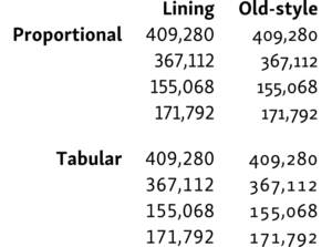
In monospaced typefaces, letter and character widths are equal, so they take up the same amount of horizontal space. As monospaced characters are easy to read in large code blocks and display well at low resolutions, they are often used for tables and number-heavy text and they are popular among programmers. For the same reason, they tend to have a technical and dull feel. Some proportionally spaced fonts come with additional sets of monospaced figures, also called tabular numerals. In the case of font Web use, this has to be declared in the CSS by setting the font-variant-numeric property with a value of lining-nums and tabular-nums.
Here is a comparison that shows why choosing tabular numerals over proportional ones in tables matters by Richard Rutter.
Some fonts, like Courier or Arial, and highly readable but not liked by designers. Even if legibility is important, there are many options outside these fonts, like Cousine, PT Mono, Helvetica, Gentona, Avenir, or Myriad Pro. Besides typeface choice and resolution, font and background color also play a part in readability. Even a highly-legible font can become unreadable if placed on a busy background, or if there is too little contrast between the font and background color.
Other practical considerations include implementation and licensing.
Web-safe fonts still exist, and they are still important because they can serve you as a fallback for your chosen typeface through a so-called CSS font stack. Font stacks are lists of similar fonts going from preferred to web-safe, declared in your web project’s style sheet. It usually looks something like this:
Google Fonts has a similar role as web-safe fonts: it is a library that includes free and open-source typefaces, and APIs for using the fonts via CSS. These fonts can reliably work even without a fallback option. Some of the most popular options in their library are Roboto, Open Sans, Lato, Oswald, Montserrat, Source Sans Pro, and Raleway. If you are working on a web project, it’s worth checking because the licensing of fonts can be costly. Another option can be licensing through Adobe Font: they have a much larger library than Google but the fonts bought here will be tied to your Adobe subscription.
Designers’ favorites
Most designers have some go-to font choices: Helvetica, Garamond, Futura, Bodoni, Frutiger, Gotham, and Caslon. These are all typefaces containing a wide variety of fonts, meaning that they are highly versatile. They are all slightly overused, as one would expect, but I don’t think most average users notice that. It’s also a matter of taste and as you see, it also depends on the nature of the project.
But here’s a list of some of my personal favorites and why I like them:
For screen use
FS Meridian
FS Meridian is a sans serif font that is monoline but still doesn’t lack character and rhythm.
Maximus Sans Family
Maximus Sans Family is a very modern, dynamic, and playful font, that is clean, but not sterile or rigid.
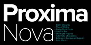
Proxima Nova
Proxima Nova is Highly versatile, modern, and legible – it’s a safe choice for almost any project.
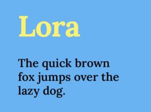
Lora
Lora is a free web font by Google that still looks pretty has character and is relatively easy to read. It also has some variants with different weights, which makes it ideal for smaller web projects.
For print use (and headlines)
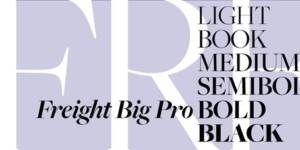
Freight Pro
Freight Pro is available on Adobe Fonts, it is a very large font family with an extensive character set, so it is very versatile. But it also has a lot of character and elegance.
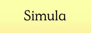
Simula
Simula is a very functional but also beautifully crafted serif font.
Zenith
Zenith is a very special Typeface that combines a default font set with alternate characters to make each word unique. Ideal for a logo project, where designers often use readily available fonts (often with some tweaking in order to make the logo unique).
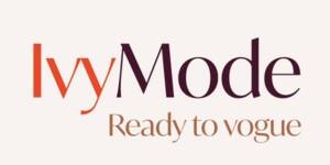
IvyMode
IvyMode is a font that is ideal for high fashion and professional beauty-related projects, and magazines as well.
The most hated
There are some infamous fonts designers love to hate, like Comic Sans, Papyrus, or Brush Script. Most of these fonts are classified as display typefaces, and the thickness of their character strokes can vary a lot, giving them a strong character and also, a reputation. However, these fonts were also created once to serve a specific purpose – in the case of Comic Sans, for example, to imitate handwritten comic text bubbles. The problem is not the font itself, but that they are not used correctly. If you are new to typography, here’s my advice: if a typeface has a very distinct look, it probably has a special mission – for general use, it’s better to stick to the less novel-looking ones.
The future of typography
In 2016 Adobe, Apple, Google, and Microsoft revealed new Variable Fonts within OpenType that enabled designers and consumers to define the weight or width of a font within a predefined range. Soon there will be websites adapting font size and weight to the screen size or even to the distance between the user and the screen. Maybe not far from now, the font on the web will function like emojis – by changing color and shape based on user setup, or even including little animations.
Takeaways
I hope this guide gave you a clearer picture and will help you to find the best typography design for your specific needs! Maybe if you are a financial entrepreneur, you believe font choice does not matter much to your clients. But we have seen that just by choosing monospaced numerals for your reports you can give them a better reading experience, and in the end, better understanding, and clarity. The devil is in the detail!
At the Cecily Group, we are working on our Entrepreneurial Tool to help other companies to form their on- and offline strategy.