
Website navigation is essentially a set of hyperlinks that leads your web browser to other URLs. It might not sound too exciting but still, website navigation is one of the keys to the success of your website. When a client arrives at your website he expects to find what he’s looking for, and your navigation system serves exactly that purpose. From that point of you, navigation is one of the most crucial parts of your site that enables it to fulfill its core function. A survey by Clutch (https://clutch.co/web-designers/resources/top-6-website-features-people-value) has found that 94% of users say easy navigation is the most important website feature. Consequently, as stated in the survey done by Hubshout, 33% of users will leave a site that is difficult to navigate (https://semify.com/?Mobile-or-Bust:-Businesses-Need-to-Know-These-Mobile-Search-Statistics&AID=1670). On the other hand, it’s also confirmed that website visitors tend to ignore navigation – until they need it. Last but not least, internal links also help search engine bots index your website and send you the right kind of traffic. In this article, we’ll discuss how navigation is structured and what are the best practices for designing your own.
The key elements of navigation
There are essentially three types of navigation. Structural navigation connects one page to another based on hierarchy, for example, a landing page and a subpage. The main navigation is like the backbone of your site that gives structure and shapes it. Structural navigation consists of main navigation (also called primary or global navigation) and local navigation (also called sub-navigation). Main navigation gives your visitors the most basic clues about your website content, helps them to find directions, and often also informs them where they are within your site. If your site has a complicated structure it can help them to switch between different topics and services you are providing. The company logo is also often a part of this navigation, serving as a home button. It’s called global because it usually appears in a consistent position and format through the website. Local navigation is used to access pages within a given category and doesn’t stand on its own but serves as a completion of the main navigation. While global navigation offers a greater overview, local navigation promotes site exploration. Your home page or landing page is also a part of the main navigation in the sense that it points people to other, sub-level pages.
Associative navigation crosses structural boundaries by connecting pages with similar topics and content. Common examples are associative links, quick links, and footer navigation. Associative links can be either embedded in the content or placed as related at the end of the content. One special kind of associative or contextual navigation is adaptive navigation where the links are generated based on user behavior – like personalized recommendations on e-commerce sites. Quick links help access areas that are not represented by upper-level navigation options – they can serve as a site map but often seem unorganized and better be replaced by sub-menu items or even footer navigation items. Footer navigation is essentially for supplementary information like Impressum and the terms and conditions page but it can also contain useful features or community options like the utility navigation.
Utility navigation is generally for pages and features that help people use the site itself, like a help page, a language or country selector, print or share options, and other tools. Internal page navigation (like internal search options or jump-to links) and extra-site navigations (like embedded web browsers) also belong here. I would also list Breadcrumbs here, since they are helping users visually understand their location on your website, and the path they have taken to that point.
Types of navigation design
While associative navigation and utility navigation elements often appear as simple text links, structural navigation items can have many different shapes and behavior. The top bar is probably the most common when it comes to global navigation. It’s often combined with a sidebar or dropdown as local navigation. But fly-in sidebars can also be used as main menus, with fold-out menu times as locals. Some sites have full-page navigation that in an active state cover the full screen – often as a solution to the limited mobile space.
Tips for a good navigation experience
- Keep it simple: as mentioned people are mostly focused on the page content and their goal, so it makes sense to include the most crucial part of your message and the most sought-after part of your content on the main page.
- Identify the key items: your home page and main menu should contain every item that drives sales on your site. All the other links can probably go elsewhere.
- Limit steps: when there’s a 4-level structure with 10 menu items in each, you have probably overdone it.
- Be specific: Research by Tank Design shows that people generally don’t know what generic labels like “Products,” “Solutions,” “Services” and “Resources,” mean, because they all sound interchangeable. Be specific with the labels so they intrigue people and serve as a call to action.
- Have it fixed: According to the research from Smashing magazine, sticky menus are 22% quicker compared to regular ones.
- Don’t hide it: the worst kind of navigation is the one people can’t find. It has to be visible and be where people expect to find it.
- Keep it small: while it has to be visible and consistent, it shouldn’t take up too much space. Remember, people are there for the content, not the menu.
- Don’t expect too much effort: it might sound cool to have sub-items that appear and disappear on hover, but some of your visitors might not find it amusing if they fail to click on them. Also, if the labeling is creative but ambiguous, there’s a danger that they simply won’t take the time to figure it out. Complicated structures are also problematic because they require exploration and mental effort.
- Include links as well as menu items: as explained above, they help users to move outside the page hierarchy which can speed up navigation. They can also link related content and by that, help page exploration.
- Have a search function: especially if your website is large and your menu has a lot of items, it’s probably easier for users to type in what they search for. However, some products and services would require a very intuitive search engine, so that’s also something to consider.
- Have filters: if your items are not easily searchable through a search box, you can also set up filters on the side. They will help your users to limit choices instead of searching for individual items.
- Don’t distract: on some pages, it might make sense to limit menu items or remove them completely, for example, if the user is in a process that requires focus, and/or leaving the page would lead to data loss. This is the reason why on order or payments pages often even the global menu is hidden.
Desktop vs mobile
Website menus nowadays have to be functional on mobile as well as on desktop. 57% of users say they won’t recommend a business with a poorly designed website on mobile. The problem is that it’s likely you won’t be able to use the same navigation design for your mobile site and desktop site. The reasons are that on a desktop the preferred content format is horizontal, while on mobile it’s vertical. As result, it’s now common practice to have a separate, vertical navigation bar for mobile. On desktop, interaction is click-based, while on mobile it’s gesture-based. If your menu has items that fold out on hover, for example, you’ll need to find another approach for your mobile site. Hypertext links are also replaced with bars, tabs, and buttons, both on mobile and desktop to help cross-platform compatibility. Mobile sites helped to popularize simplistic menus as complicated navigation structures won’t translate well to smaller devices.
Testing
The easiest way to find out if your navigation is working well is by looking at the paths of your customers through the site in web analytics. If some pages get very few visitors and are listed as sub-menus or footer links for example, maybe it’s worth it to rethink the structure. If people keep asking you about information that is already available on your site that’s also a good clue that it’s not easily accessible enough. You can also run user testing and ask for direct feedback – in-website testing and research might cost but can save you from losing some potential clients.
Examples
If you only need an elegant menu with few items, Sokruta has a nice, slide-in side menu example. (https://sokruta.com.ua/en)
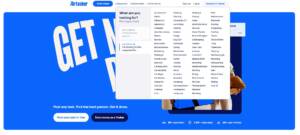
If you have a larger site with an extended menu you should look at AirTasker’s site. They managed to keep it simple in terms of structure but completed it with some advanced filtering options.
If you like descriptive menu items as we do, one excellent example is the No women, no peace site.

If you believe that the menu will break or make your site you will like Krause’s – they were not afraid to put it in the limelight.

Eagle films are another example of this trend.

If you link to think outside the box, Polymachine’s site has an original approach to navigation that is user-friendly despite being unusual.

I hope that this article helped you to have a better picture of recent web navigation trends. My main advice is, before setting up a menu system for your site, don’t forget to consider the bigger picture. There are plenty of options available, and there’s a way to find what will fit your purposes best.
At the Cecily Group, we are working on our Entrepreneurial Tool to help other companies to form their on- and offline strategy.