
Tables are a common way to display data and information on websites, but they are often overlooked from a visual and user experience perspective. For Family Offices, like The Cecily Group, it’s essential to display metrics in a way that is user-friendly: well-structured, legible, accessible, and cross-device compatible. In this article, I’ll list a few practical steps you can take to create better tables for your website.
Define the Purpose
Step zero for any table asks if a table is the best format for your data. If you have fewer data points, you might get better results by just creating lists, and if you have very complex data points, it might make more sense to display them as a chart visualization. After we decided to create a table, the first step is to get a clear objective on the key, secondary, and important metrics, and which metrics are complementary or optional. In this stage, we define the table and header titles and decide if the tables should be divided into multiple tables, or if some tables could be merged. When the objective of the table is clear, we can move on the refine the structure.
Complex table structure design by Slava Shestopalov.
Organize Data
Organizing and prioritizing information is crucial in enabling users to quickly find what they need in the table. Simplicity, order, and consistency help to give better cues at first sight, as well as in longer-term usage. Here’s a comprehensive list of the steps:
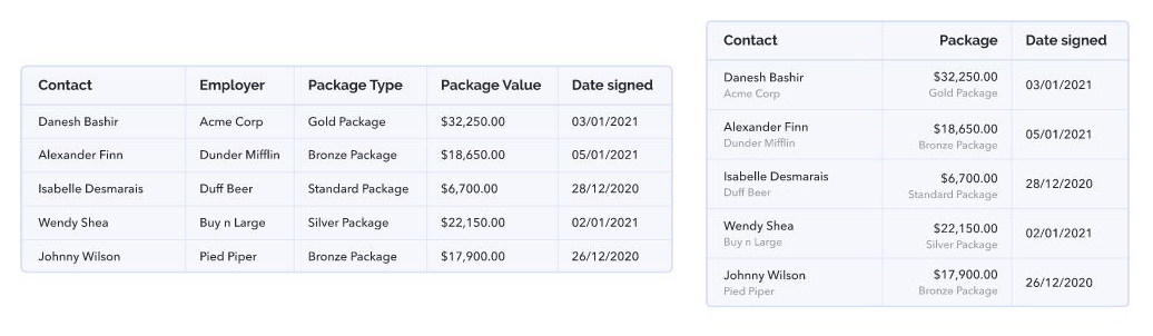
- Group: group data into meaningful categories and use clear and concise labels for each column and row. Use clear and concise labels for each column and row, and group related data together.
- Provide Context: Provide context to the data by adding informative headings, captions, and footnotes.
- Simplify: avoid cluttering the table with too much information and remove any unnecessary columns or rows and presenting too much information in a single table. Instead, break up complex information into smaller, more manageable tables. Avoid having empty or unnecessarily wide columns by breaking them up or merging them with other columns. Avoid repeating data through the fields, and place them as labels when possible. Use title abbreviations where appropriate to save space and prevent the table from looking cluttered.
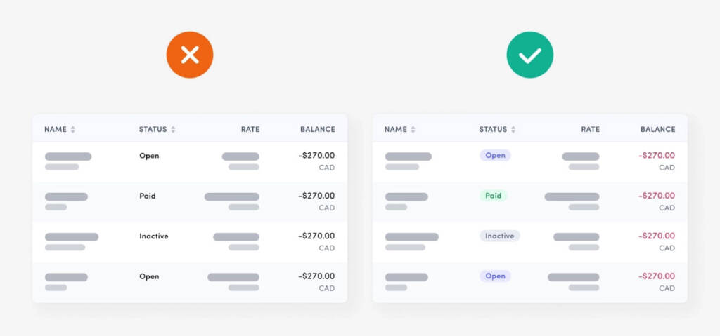
- Prioritize: The most important data should be highlighted and presented in a way that stands out. Use visual cues like bold text, color, or icons to emphasize important information. Use formatting techniques such as shading, borders, and different font styles to draw attention to crucial data like end calculations. Make sure that even if you must have merged cells, or have multiple rows within one cell, it’s clear which label applies to which row. In such cases, different rows should have different formatting styles, and that should be reflected on their labels.
- Standardize: Use consistent formatting for fonts, colors, borders, and spacing throughout the table, and across tables.
Highlighting key data in a table by HoloLab.
Structuring data in a table by Fanny Vassilatos and Ceara Crawshaw.
Make it Legible
Legibility directly impacts the user’s ability to read and understand the information presented. Here’s what you need to do to avoid a difficult reading experience:
- Use the right Fonts: Sans serif fonts with clear letterforms and appropriate spacing are generally easier to read also in smaller sizes. Smaller font size means that you can fit more data in one table, however, its accessibility is also something to consider here. An accessible font size is one that is large enough to be easily read by a wide range of people, including those with visual impairments or who are reading on smaller screens. While the ideal font size may vary depending on the font style and the reading distance, a font size of at least 16 pixels (or 12 points) is generally recommended for body text on desktop and mobile devices. Using monospaced fonts could also be a good idea because each of their characters takes up the same amount of space, so the data in each column will be aligned vertically, making it easier to read and compare data, especially when working with numbers.
- Use Clear Number Formatting: To make it easier to read large numbers, it’s advisable to use commas as a thousand separator. To make it easier to compare numbers consider aligning the decimal points in a column. This makes it easier to compare the magnitude of different numbers in a column. Using abbreviations for large numbers (like 1,000,000 as 1M) can also help to make the table more readable and avoid clutter.
- Use Appropriate Padding: padding between table cells and rows helps to prevent the table from looking cluttered and makes it easier to read.
- Use Alternating Row Colors: “Zebra Stripes” help users distinguish between rows in the table. This can make it easier to read and follow the data, particularly in tables with large amounts of information.
- Use High Contrast Colors: high contrast colors for text and background make the table easier to read. This is especially important for users with low vision or color blindness.
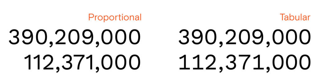
Proportional vs. tabular (monospaced) figures by Matthew Ström.
Make it Accessible
Designers and developers tend to think that accessibility concerns only apply to a small group of users, and developing for them is a secondary concern. According to Statista as of April 2022, there are 5 billion global web users who benefit from accessible web practices, including disabled people but also newly adopting web-users. In fact, some research suggests that accessible design is better for everyone. Here is your to-do-list for accessible tables:
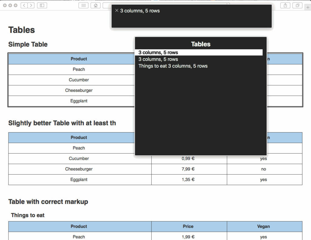
- Use Appropriate Markup: Use HTML markup to structure tables correctly. Tables should be marked up using the
,,,,,, and elements in the correct order. This makes it easier for assistive technology to interpret the table data.
- Provide Column and Row Headers: Column and row headers provide context and help users understand the structure of the table. Use theelement to markup header cells and the scope attribute to indicate whether they apply to a column or row.
- Avoid Empty Elements: Avoid using empty tables columns and rows (even as spacing), have data in every table cell, and include header text for every column. Even if the label does not apply to a certain field (i.e. a feature is not available), we have to communicate that to the user in non-visual ways, like through alt texts.
- Use Simple Table Structures: Use simple table structures that are easy to understand and navigate. Avoid using nested tables or merged cells, as these can be difficult for some users to interpret. Use the
element to provide a summary of the table’s purpose. - Make Tables Keyboard Accessible: Users should be able to navigate the table using the keyboard alone, without relying on a mouse or other pointing device. This will also speed up navigation for users who are familiar with this method.
- Provide Alternative Text for Charts: Provide alternative text for any images used in the table. This helps users with visual impairments understand the content of the table.
- Test with Assistive Technology: Test the table with assistive technology, such as screen readers, voice recognition software, or magnification tools, to ensure that it is accessible to all users.
Screen reader trying to interpret a web table by a11y-101.
Make it Responsive
Responsivity allows the table to adapt to different screen sizes, ensuring that the content is always easily accessible and readable, regardless of the user’s device. When creating responsive tables, you should:
- Use Percentage Widths: Use percentage widths for the table and its columns instead of fixed widths. This allows the table to adjust to the width of the screen or container it’s in, making it more responsive.
- Use Breakpoints: Use breakpoints to adjust the table’s layout for different screen sizes. For example, you might adjust the number of columns displayed or the font size used to make the table more readable on smaller screens.
- Hide Columns: Hide columns that are not essential on smaller screens to make the table easier to read. You can do this by setting the display property to none for the appropriateandelements.
- Use Horizontal Scrolling: Use horizontal scrolling for tables with many columns. This allows users to scroll horizontally through the table on smaller screens, rather than having to zoom in or scroll vertically.
- Make Text and Cells More Compact: Make the text and cells in the table more compact on smaller screens. You can do this by reducing the font size, adjusting the line height, or using abbreviations or icons to represent longer text.
- Use a Vertical Layout: Consider using a vertical layout for the table on smaller screens. This means stacking the rows of the table vertically instead of horizontally. This can make the table easier to read on smaller screens.
- Test on Multiple Devices: Test the table on multiple devices and screen sizes to ensure that it is responsive and readable. This will help you identify any issues or improvements that need to be made.
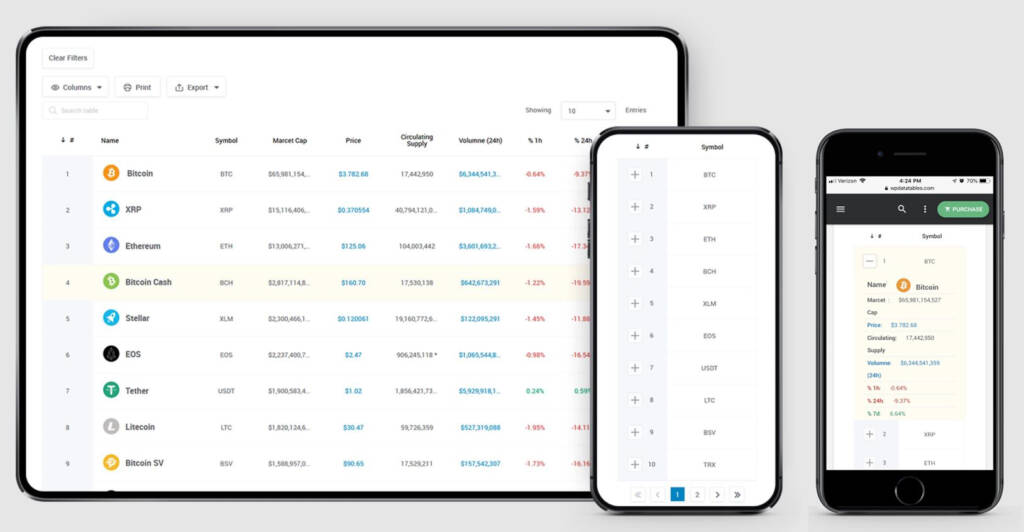
Responsive web table design by Suzanne Scacca.
Make it Interactive
Static tables are remnants of the past: interactive web tables enable users to analyze and interpret data within web applications, and it’s becoming the new norm. You can use JavaScript libraries such as DataTables or TableSorter to implement sorting. filtering and pagination. Here are few additional ideas for interactive data displays:
- Use Sorting: Allow users to sort the table by clicking on column headers. This can help users find the information they need quickly and easily.
- Use Filtering: Allow users to filter the table to display only the information they need. This can be done using search boxes, dropdown menus, or other filter controls. More advanced filtering options will connect data points across charts and tables, enabling drill-downs for certain metrics.
- Use Pagination: If the table contains a large amount of data, consider using pagination to break it up into smaller chunks. This can make the table easier to navigate and reduce load times.
- Use Tooltips: they provide additional information about the data in the table. This can help users understand the data better and make more informed decisions.
- Use Charts and Graphs: Use charts and graphs to visualize the data in the table. This can help users understand trends and patterns in the data more easily. Make sure that charts are clearly connected visually to the relevant tables. More advanced interactive chart options include custom charts and chart type selection.
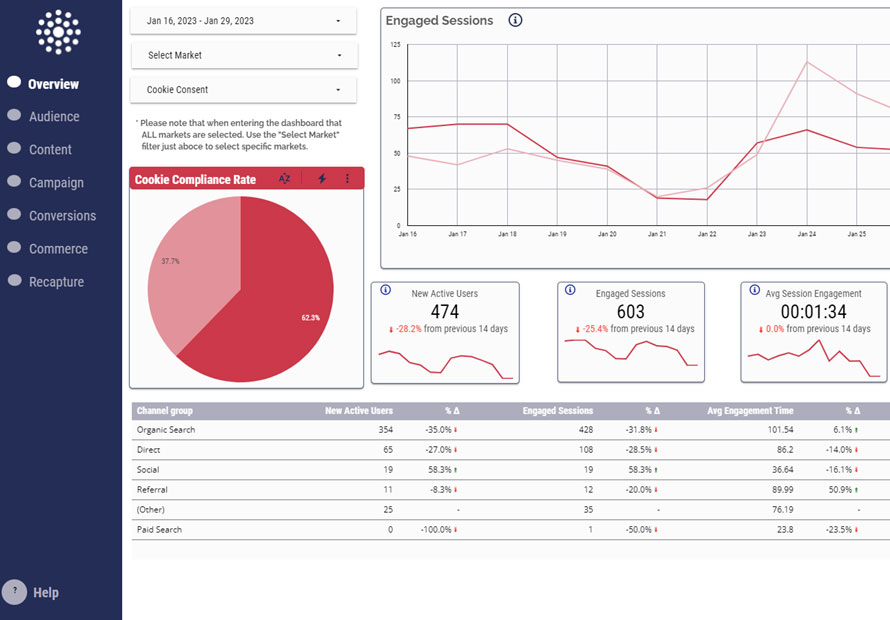
Google Looker Studio interactive Dashboard example by IIH Nordic.
In conclusion, crafting tables right is an important tool in improving the user experience on your website. By keeping it simple, prioritizing information, organizing data, making it accessible, and using consistent formatting y, you can create effective and visually appealing tablesAt the Cecily Group, we are committed to excellence in service and the tools we use. We are here for you to explore cutting-edge business solutions for you and with you. We wish to help young entrepreneurs to have the best possible start with their businesses, and if you are one of them, you can read more about the Entrepreneurial Tool here.