
Pop-ups have been a part of the internet experience for many years, but they continue to be a controversial topic in the world of user experience design. While they can be effective in capturing attention and driving engagement, they can also be frustrating and disruptive to users. In this article, we’ll explore the pros and cons of pop-ups and how to use them effectively.
What are pop-ups for?
First, let’s define what we mean by pop-ups. Essentially, they are windows that appear over the top of the main browser window, typically triggered by user actions such as clicking a button or link, or by timing-based triggers such as after a certain amount of time on a page or when the user is about to leave the site. Pop-ups can take many forms, from simple messages to full-screen overlays that require user interaction.
One of the biggest advantages of pop-ups is their ability to grab attention. They can be an effective way to communicate important information to users or to prompt them to take action. For example, a pop-up might ask users to sign up for a newsletter, provide feedback on their experience, or offer a special promotion. By appearing on top of the main content, pop-ups can’t be ignored as other types of content can.
However, pop-ups can also be frustrating and disruptive to users. They can interrupt the user’s flow and distract from the main content of the site. They can also be seen as intrusive or pushy, which can negatively impact the user’s perception of the site or brand.
Some pop-ups provide useful or even crucial information to the user, guide them through complex processes, or alert them to important updates, errors, or changes. Other pop-ups are for collecting information from the user, like their personal data for marketing purposes, or feedback. When designing the pop-up, it should also be considered, whose needs it will serve. A message that is providing information should be framed and displayed differently, than one that is asking for a favor.
Different types of overlays
Overlays can be categorized as either modal or non-modal.
Modal overlays are the most common type of pop-up design used in user interfaces. They are designed to require user interaction and temporarily disable the underlying interface until the user has completed the task or dismissed the overlay. Modal overlays usually have a clear and concise message that prompts the user to take a specific action, such as confirming a purchase or filling out a form.
Non-modal overlays are overlays that do not require user interaction to continue interacting with the underlying interface. They can be used to display additional information or provide feedback, such as a tooltip or a progress indicator. Non-modal overlays usually appear as a small window or pop-up and do not require the user to take any action.
Generally, modal overlays should be used when the user needs to complete a specific task or decide on something before continuing with the underlying interface. Non-modal overlays should be used when the user needs additional information or feedback but does not need to interrupt their current flow. Also, non-modals feel generally less intruding and limiting to the users, because they leave more room for user choice.
The background behind modal overlays is usually dimmed, in which case the pop-up itself can also be called a lightbox. It’s a visual clue to the user that the dimmed parts of the page are inactive. In some cases, designers combine non-modal overlays with dimmed backgrounds, as a middle ground. This could be useful because it draws attention to the pop-up but still leaves the user with more options.
Alternatives to Pop-ups
Overlays are useful, but not all messages need to be pop-ups. One of the most common reasons for misusing pop-ups is a lack of awareness of their alternatives. These alternatives can present an effective way to communicate important information to users without disrupting their flow or causing frustration.
Inline Messaging
Inline messaging refers to messages that are integrated directly into the main content of the interface, rather than appearing as a separate window or overlay. Inline messaging can take many forms, such as a banner, a toast message, or a tooltip or badge.
Here’s a nice tooltip example from Carbon Design System:
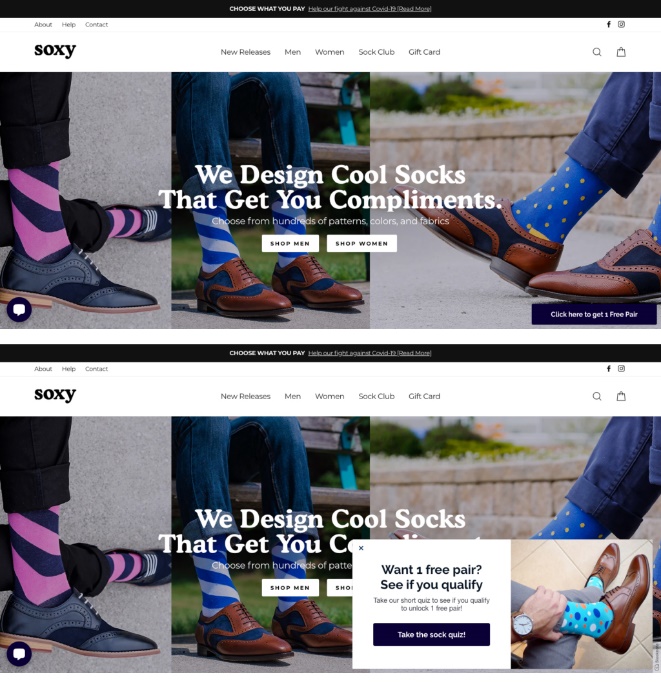
Soxy’s webshop has an interesting combination, where they only display a small bange that turns into a pop-up on click. This way, the user is not bothered or interrupted, but (hopefully) their curiosity is awakened by the teaser.
Slide-In or Drop-Down Panels
These panels appear on the interface when triggered by a user action, such as clicking a button or hovering over a specific area. The panel slides in from the side or drops down from the top of the interface, providing additional information or functionality without interrupting the user’s flow.
Here’s a simple example by Dieter Reichelt:

Interstitial Pages
These pages appear after the user completes a specific action, such as submitting a form or purchasing. These could also interrupt the user flow by showing up at the wrong times, so be careful using them. In some cases, they are even more intrusive than pop-ups, as they cover the whole page, and especially when they display advertising, promote products, or capture user information. However, when they display useful information, like a test result page, they could be a much nicer alternative to pop-ups.
One nice example is the result page of Kaye Putnam’s Brand personality quiz:

How to make pop-ups better?
When designing messages, the content, placing and timing is the deciding factor in the user experience, more so than the format itself. As an example, here are two messages on the same page. One is an inline message, while the other is a pop-up. The inline message is more intrusive since it is placed mid-content, while the pop-up is placed on the sidebar.
So how can we use pop-ups effectively without frustrating our users? Here are a few best practices to keep in mind:
- Keep it simple: Use clear and concise messaging in your pop-ups, and make sure the call to action is easy to understand and act on. Users tend to dismiss modal overlays hastily, so you can’t assume that a complicated and long message will be delivered.
- Don’t steal the spotlight: non-modal overlays that don’t want to occupy a central place will do better. They don’t push the user to interact right away, so they get better chances to be read at some point.
- Make it easy to dismiss: Provide a clear and easy way for users to dismiss the pop-up if they’re not interested. Everything else is an annoyance.
- Use sparingly: Save pop-ups for important messages or calls to action. Avoid showing multiple pop-ups on top of each other, it will always look chaotic. Instead, combine it with one of the above-listed alternatives if you must display multiple messages on the same page.
- Don’t interrupt: Use timing-based triggers carefully to avoid interrupting the user’s flow. For example, wait until the user has spent some time on the page before showing a pop-up, or trigger it when they are about to leave the site. This is important because Google rewards websites with accessible content, and will worsen your search engine score if the user flow is interrupted at key points. One of the examples they give is showing a popup that covers the main content, either immediately after the user navigates to a page from the search results, or while they are looking through the page.
- Give-before-take: let users access what they need, before asking for anything. Ask for feedback immediately after the completion of the task, but not midway.
- Test and iterate: Use A/B testing to experiment with different types of pop-ups, panels, messaging, and triggers to see what works best for your users. Iterate based on user feedback and data to continually improve the user experience.
In conclusion, pop-ups can be a powerful tool for driving engagement and communicating important messages to users, but they must be used carefully to avoid frustrating or alienating users. It’s worth exploring different approaches, and even alternatives because a lot of the common practices we see on websites are not necessarily the best.
At the Cecily Group, we are committed to excellence in service and the tools we use. We are here for you to explore cutting-edge business solutions for you and with you. We wish to help young entrepreneurs to have the best possible start with their businesses, and if you are one of them, you can read more about the Entrepreneurial Tool here.